Isadore, the Slovak cycling apparel brand, has introduced a new logo, identity and several changes to the brand.
The company was founded by former professional cyclists brothers Martin and Peter Velits and sells its products through its own website to more than 50 countries worldwide.
The new logo and brand identity have been created by Andrej&Andrej studio. These changes are part of a larger scheme of plans as the brand looks to the future.
When modifying the brand’s visual expression, Isadore says there were several reasons for the logo change.
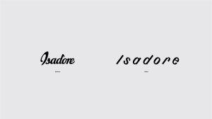
Before and after the update
The previous calligraphic logo had its objective limitations – the letters were joined by thin lines, so when stretched on clothing, the logo was distorted and the thin seams wore out more quickly.
The logo was visually more robust, so it had to be smaller on the products and the brand says it was “losing a very important and most visible carrier”.
It was also more difficult to combine it with other graphic elements or fonts in communication.

This is part of the brand’s new identity
The new logo and identity are designed to deliver better consistency from the smallest label on a jersey, to communication, to identifying a passing jersey on the road while riding.
Martin Velits, co-founder of the Isadore brand and head of product, said: “The replacement of the logo, the associated modification of the identity and, above all, the fundamental redesign of the main products. These are some of the bigger changes we are currently going through at Isadore.
“We worked on them for most of the past year, which was one of the most demanding for our industry. This fact accelerated actions that otherwise might not have been approached so vigorously, in such quantity and intensity.
“In any case, we are proud of these changes and very happy that thanks to them, we have once again expanded the circle of talented people with whom we have the opportunity to work at Isadore.”
Isadore believes the main advantages of the new logo are freedom and functionality.
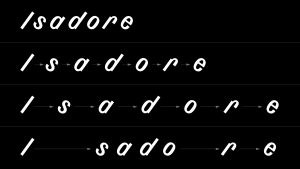
The logo remains clear when stretched
If it is smaller on the actual products, it becomes elastically larger when worn, but its shape and aesthetics are maintained.
Andrej Barčák, co-author of the new identity, said: “The visual identity is inspired by cycling – specifically when riding in a peloton, in which cyclists try to keep the same pace and the same distance between each other.
“The principle of spacing is used in the logotype and visual identity and is expressed through the spaces between the letters.
“This makes it possible to work variably and adapt to diverse content, specific use on jersey designs and elastic materials.”